 From Taxonomy to Visualisation... the NewsEdge Way
Jinfo Blog
11th March 2015
By Chris Porter
Abstract
Chris Porter considers the connections between taxonomy and visualisation, with particular reference to Acquire Media's news management and delivery tool, NewsEdge.com.
Item
![]() There I was, at a company event in a very agreeable beachside hotel, preparing to go down to dinner, when somebody rang me up on my then rather chunky, not to say brick-like, mobile phone and offered me a job in... taxonomy.
There I was, at a company event in a very agreeable beachside hotel, preparing to go down to dinner, when somebody rang me up on my then rather chunky, not to say brick-like, mobile phone and offered me a job in... taxonomy.
After a missed first course, and then a couple of days of vigorous debate, the somewhat reluctantly-reached deal was that I would do the project for a year and then move on to other things.
However, as others may also have found, rather more time can be served in the taxonomy trenches than one had originally anticipated. I did eventually emerge blinking into the daylight some six years later; but ever since, the dreaded and beloved "T" word keeps cropping up in various guises as one continues one's journey through the business information landscape.
Visualisation in NewsEdge.com
One recent encounter was while taking a detailed look at the visualisation capabilities in NewsEdge.com from US-based company Acquire Media.
As many FreePint users will know, NewsEdge.com is an enterprise-level news management and delivery tool providing global, multilingual content coverage from a combination of licensed and web-crawled sources.
It benefits from a series of visualisation capabilities, including a "Heat Map" to help you pick out hot stories over time; a series of overlapping Venn diagram displays looking at clusters of topic themes within a group of stories; and a Tag Cloud.
Taxonomies and Word Clouds
A key underlying element driving these displays is nothing other than a proprietary Acquire Media taxonomy.
The use to which it is put is neatly illustrated in the NewsEdge Tag Cloud display below.
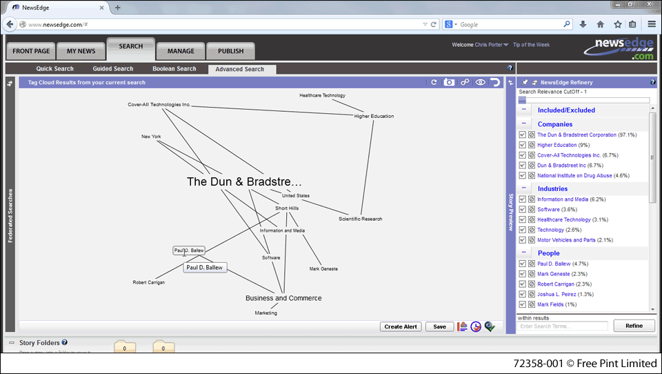
Figure 1: NewsEdge Tag Cloud
Unlike many other - in my experience, often very uninformative - "word cloud" implementations one sees in the business information market, this one reflects the most frequently occurring NewsEdge taxonomy terms within the results set.
The size of the terms in the display reflects the prominence of the topic element within the results; connecting lines highlight relationships between topics.
Similarly the NewsEdge.com Heat Map and Venn Diagram features draw on the Acquire Media taxonomy terms to help users to navigate their way through masses of content and pinpoint key themes.
The taxonomy thread is to be found running through quite a number of vendor visualisations of content; as the Mini Review of NewsEdge.com visualisation capabilities makes clear, this particular implementation has some unique features, which can definitely appeal to those of us who are familiar with the challenges and delights of the "T" word.
Click here to access the review.
This Blog Item is part of the FreePint Topic Series "Making Information Visible".
- Blog post title: From Taxonomy to Visualisation... the NewsEdge Way
- Link to this page
- View printable version
![]() Related articles:
Related articles:
- Mini Review of NewsEdge Visualisation Features
Friday, 27th February 2015 - Mini Review of Commetric
Friday, 20th February 2015 - Q&A with Acquire Media - Visualisation Delivers the Insight You Need
Monday, 16th February 2015 - Mini Review of Nexis Analyser
Monday, 22nd September 2014
![]() Related Blog items:
Related Blog items:
- Tools that Take Us Beyond Search and Retrieval
Friday, 27th February 2015
![]() Related reports:
Related reports:
- Product Review of LexisNexis Publisher
Monday, 12th January 2015 - Product Review of Factiva
Wednesday, 17th December 2014 - Product Review of NewsEdge.com
Tuesday, 28th October 2014
Register for our next Community session:

Stakeholder value and AI
25th June 2026
Latest on our YouTube channel:
Read on the Blog:
June 2026 update
2nd June 2026
- June 2026 update
2nd June 2026 - Training before access – a new control layer for AI?
26th May 2026 - May 2026 update
6th May 2026
- Practical workshop: stakeholder value and AI (Community) 16th July 2026
- Stakeholder value and AI (Community) 25th June 2026
- Content investment for AI (Community) 19th May 2026